

ADAM POLAK
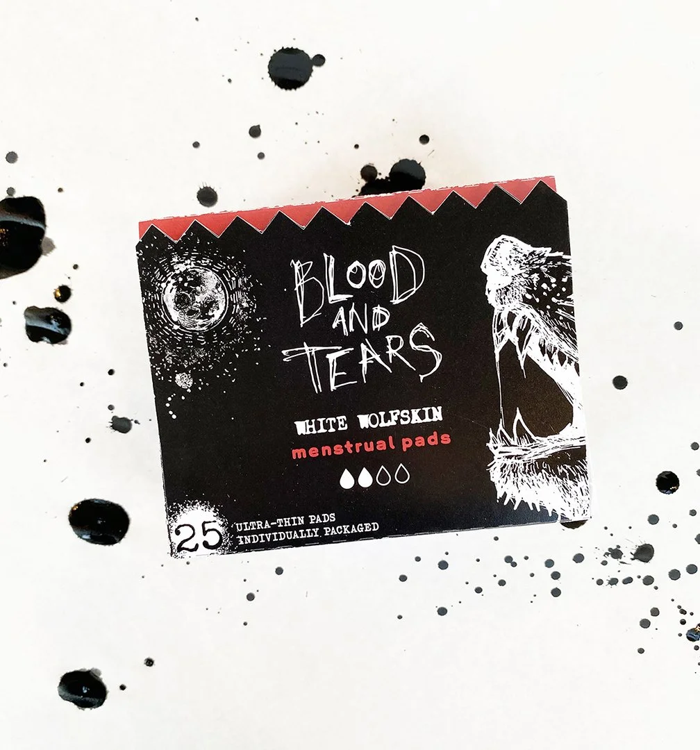
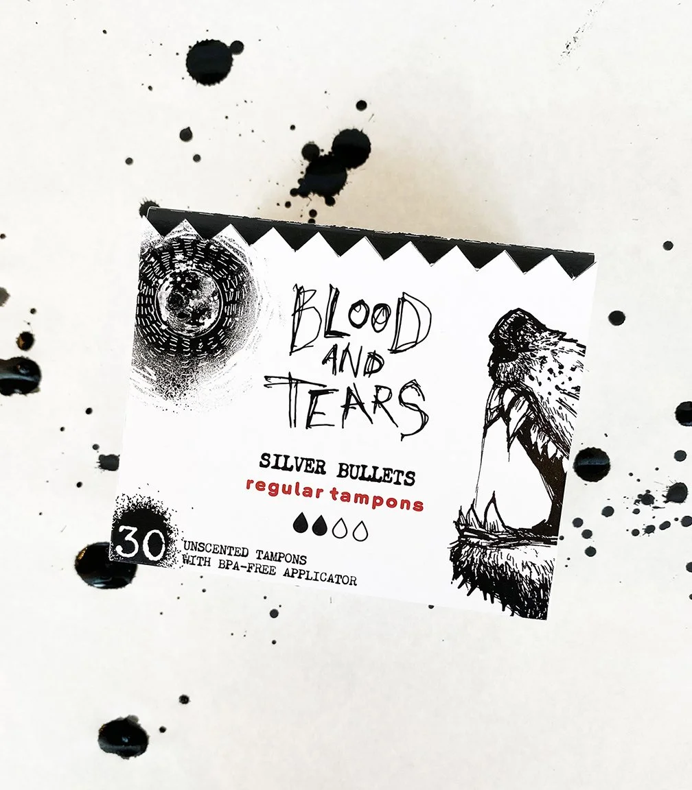
Blood and Tears
This is a brand I developed to create emotionally honest period packaging. Traditionally, packaging for menstrual products has either been discreet and sterile or cutesy and floral. Blood and Tears is neither, using werewolf imagery to evoke the idea of a monthly lunar transformation.


A Queer Year of Love Letters
This type exploration features the 8 different typefaces of Nat Pyper's A Queer Year of Love Letters project. Pyper is a self-described "alphabet artist" who designed each of these typefaces around a piece of queer history. Every type file contains a readme.txt that provides context to the font’s creation.


Red Rose Tea Redesign
In reimagining Red Rose’s herbal tea collection, my goal was to refresh the brand but keep a vintage feel. “Blended with love” is their main tagline, so I used my own love of design to create illustrations for my primary display panels, emphasizing the tea’s natural color and flavor.


Being Here and Wanting to Be Here
My first book, Being Here and Wanting to Be Here, is an ace doubles book exploring gender dysphoria and euphoria. While the “euphoric half is more traditionally designed and straightforward, the “dysphoric” half creates discomfort by requiring the reader to turn, shift, and squint at pages to read the text.


On Tyranny
This series of 11x17” posters feature the chapter titles from Timothy Snyder’s On Tyranny: Twenty Lessons from the Twentieth Century featuring the typeface None Away From the Moon. Using black & white forces you to communicate through shape & placement.

